Improving content discovery

Driving higher user engagement through improvements in content discovery
Project Overview
2 years since launch, we faced low engagement rates amongst free users due to difficulty in discovering content. This lowered our conversion rates further.

Hence, the goal of this project was to increase engagement by making it easier to discover content.
Year
2021-Present
My Role
As the lead designer of this project, I worked with product manager and user researchers to identify opportunities through qualitative and quantitative data. I delivered incremental experiments with engineers as progress towards our solutions.

Tasks: User Research, Customer insights and ideation, Planning and scope definition, User Interface Design, Prototyping
The Team
1 designer, 1 research agency, 1 product manager, 1 content manager, 4 engineers

Increased engagement via experiments

Before the product winded down due to an organisational decision to focus on main businesses, we had launched short experiments to validate our design solutions. The data received gave us confidence that we were headed towards right direction.

On experiment to showcase top faculty videos –

On experiment to enable live lecture notification –

How we got there
Identifying the problem with data
Bummed out by the low engagement rates in our app, this was also a period we were struggling to push back on the product improvement suggestions given the entire team, who felt convinced the problem was on the visual design and lack of colourful icons, or the lack of activity listings in dashboard.

While good suggestions, my product manager and I were uncertain this was the root cause of our poor engagement. We felt being stuck in "opinion-land" was going to prevent us from making any meaningful step forward, and I myself realised I had been out of touch from what our customers had been saying for the past months! 

This proved one thing – we needed desperately to go back to the customer.

With 2 product managers, 1 business analyst, and myself, we deep-dived into the problem through metrics. Our findings were eye-opening –

Current flow to view content, deeply nested and needing to sieve through long listing pages

High interest in feature menu tabs, but many drop off in between

25% of customers often click on live and practice menu tabs but only 3% interacts with content. Students has to do the hard work of finding content which causes them to lose interest before starting an activity.

This was also contradicting to our existing mental model that dashboard was the highest touch-point of content for our app. At this point, our dashboard was overcrowded.

More live lectures conducted daily > 75% increase in attendance

Currently, only “Upcoming classes” widget in the dashboard allowed students to immediately engage with a lecture, but we do not have many classes running a day.

To test whether the lack of live lectures per day caused low engagement, we ran an experiment with 12h free lectures per day. This validated our hypothesis as we saw 75% increase in attendance.

Knowing the 'why' with user research
To further inform our analysis from quantitative data, we collaborated with a user research agency to evaluate the early user experience of the product with students.

We chose the early user experience (login - onboarding - first impressions) as our main focus because during our outreach with 9 paid customers, all students indicated that interacting with a good live lecture in the first 10-15 minutes was what motivated them to purchase. The early experience is crucial to potentially convert customers.

With 10 respondents across Mumbai, Chennai, Patna and Lucknow, we conducted an online user research to understand the challenges with feature discovery in Amazon Academy app.

Overall, we found that the dashboard was overcrowded and lacking focus.

1- Easy discovery to live lectures is key for students to be engaged

Students showed interest in the upcoming lectures, and had expectation for good variety and personalities. This affirmed our previous findings that we need to increase discovery of live lectures, upcoming or past.

2- Lack of credentials in teachers decreases trust

Due to no qualification of teachers readily available, students were hesitant with the quality of our live lectures

3- Key learning items easily missed

During the sessions, we observed that students easily missed “Tip of the Day” and the navigation bar, due to the heavy layout and lack of visual contrast.

4- Learning and upsell widgets not distinct

Due to the unclear writing, students confused the free sales counselling widget, as a doubt clearance feature.

5- Irrelevant widgets clutter the page

While students understood the intent behind “What’s New” and “Featured Articles”, they were not interested to explore further.

Deep-dive into customer feedback channels
On top of research, I also looked into the NPS survey feedback to identify trends in pain points. I found that while students overall felt that it is easy to understand the categories divided by feature type and chapter, they also requested repeatedly to improve navigation in past lectures.
“Please make the past video section more convenient so that I don't have to scroll all the way down to watch very old videos”
Ultimate Pack student, NPS survey
The Challenge
Recapture simplicity of our product – help students learn easily.
I laid this as the high level goal for our redesign – be content-first. Make it easy to get to the content they need immediately, in the right chapter and the right format.

Our original dashboard started out simple with focus only on dynamic learning content (upcoming tests, tip of the day). Overtime however, as our product scaled, any important content was placed in the dashboard, causing it to lose focus. We were also under-utilising pages that more students were interested in, to showcase content, which resulted in further strain in the dashboard.

Based on our findings, I crafted these design principles to inform my design decisions –
  • Simplify the dashboard with focus on dynamic learning content
  • De-centralise discovery of content from dashboard, to feature menu screens
  • Avoid dead-ends with the pre-live class experience, add delight to the wait
Design process
Working towards a simplified, purposeful layout
Going back to the whiteboard with my product manager

Together with my product manager, we brainstormed widely on possible directions to improve content discovery, even the possibility of utilising personalisation. I crafted wireframes on different layouts that aimed to achieve these purposes –

  • Ensure there are always activities for a student to immediately get started with, through featured content or personalisation
  • Maximise learning outcomes - learn by chapter (match diary studies learnings)
  • Remove widgets not value adding to learning experience like “What's New" and “Articles for you" widget
  • Can we interlink content together through recommendations after an activity?

On the visual design front, I informed my design decisions through (1) diagnosing of improving areas in collaboration with design agency, and (2) synthesising learnings from mature design systems.
Diagnosing the visual design improvement areas with an agency
With a design agency, we deep-dived into the opportunities on the visual design front. Together we uncovered factors contributing to the visual heaviness like bulky cards and lack of hierarchy in type scale. We also brainstormed how we could bring present the new ideas in a visual manner.
Explorations by xCube

It was an interesting exercise to push the box visually, and though many of such concepts would have not been translatable due to incoherence with the design system and implementation constraints, we wanted to include the thinking towards differentiating the navigation bar more distinctly, a simplified two-tone icon and top-bar.
Synthesising learnings from mature design systems
To identify quick UI wins to reduce cognitive load and improve usability, I also studied the rationale behind key improvements in Amazon Shopping Design System and Material Design System.

This enabled me to inform my decisions with the best practices in the market, ensuring that whatever I proposed was not just for a visual uplift, but more importantly to improve usability.

Distinct colour hierarchy in navigation

  • Colour-filled navigation bar makes it distinct from content
  • Higher touch area increases accessibility
  • Subdued shade of Material does not draw focus away from the content

Increased curvature in borders

  • Introduced in Amazon Design System, based on scientific research that rounded corners are easier on the eyes and reduces cognitive load
  • Link to research used

Simplify type scale for better rhythm

  • Introduced in Amazon Design System, simplifying type to multiples of 4 for better spacing
  • Simplifying our type scale was also needed to reduce cognitive load
My early explorations across dashboard and menu listing screens, based on above learnings
Proposed Designs
New and improved focus in discovering key content
From feasibility discussions with engineers, I narrowed the scope to remove any considerations of personalisation nor popular data – we agreed to start with curated content put together by our academic team.

With our insights and explorations, I narrowed my designs to 3 broad proposals –

1- Lead with meaningful content in dashboard

I proposed a simplified layout to emphasise dynamic learning items – to ensure there is always activities for a student to immediately get started with. By removing widgets irrelevant to learning, this keeps the dashboard focused to its goal.

I reduced cognitive load and improved usability like increasing navigation bar distinction, type hierarchy, introducing rounded borders, and combining design elements to create a more simplified layout (Upsell and tele-counselling).

Avoid dead-ends

  • If an upcoming class is not live, re-direct to past relevant videos. Don’t make the user do the hard work of finding what to do.
  • Quick shortcuts are introduced to give visibility to in-progress activities, providing a convenient way for students to dive back.

Dynamic to different use-cases

The goal to make it as easy as possible to get started in an activity will mean differently for different users, and use-cases. Through these designs for different use-cases, we aim to answer these questions:

  • If there is no upcoming classes, how can we redirect the attention to past lectures more easily without the need for student to scroll down?
  • If a student has not engaged in any activity, how can we make it easy for the student to get started?

2- Lead with meaningful content in listing pages

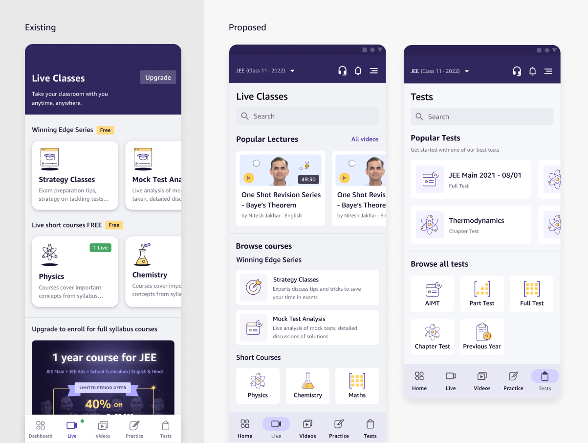
Since our insights show listing menu screens are more crucial than dashboard for content discovery, I proposed an upfront content widget. This can be a generic one for all users first then scale towards personalisation, based on efficacy of the widget.

I also proposed a search within feature function, since the past lectures search experiment proved to be successful. Implementation wise it would be more feasible than a universal one to start with.

On the visual design front, I removed the descriptors and reduce the card sizes of the menu items, so that all can be seen in one view. This simplification was proposed because students were familiar with these categories without descriptors. This prevents the need to scroll which causes menu items to lose prominence.

3 - Delightful pre-live experience

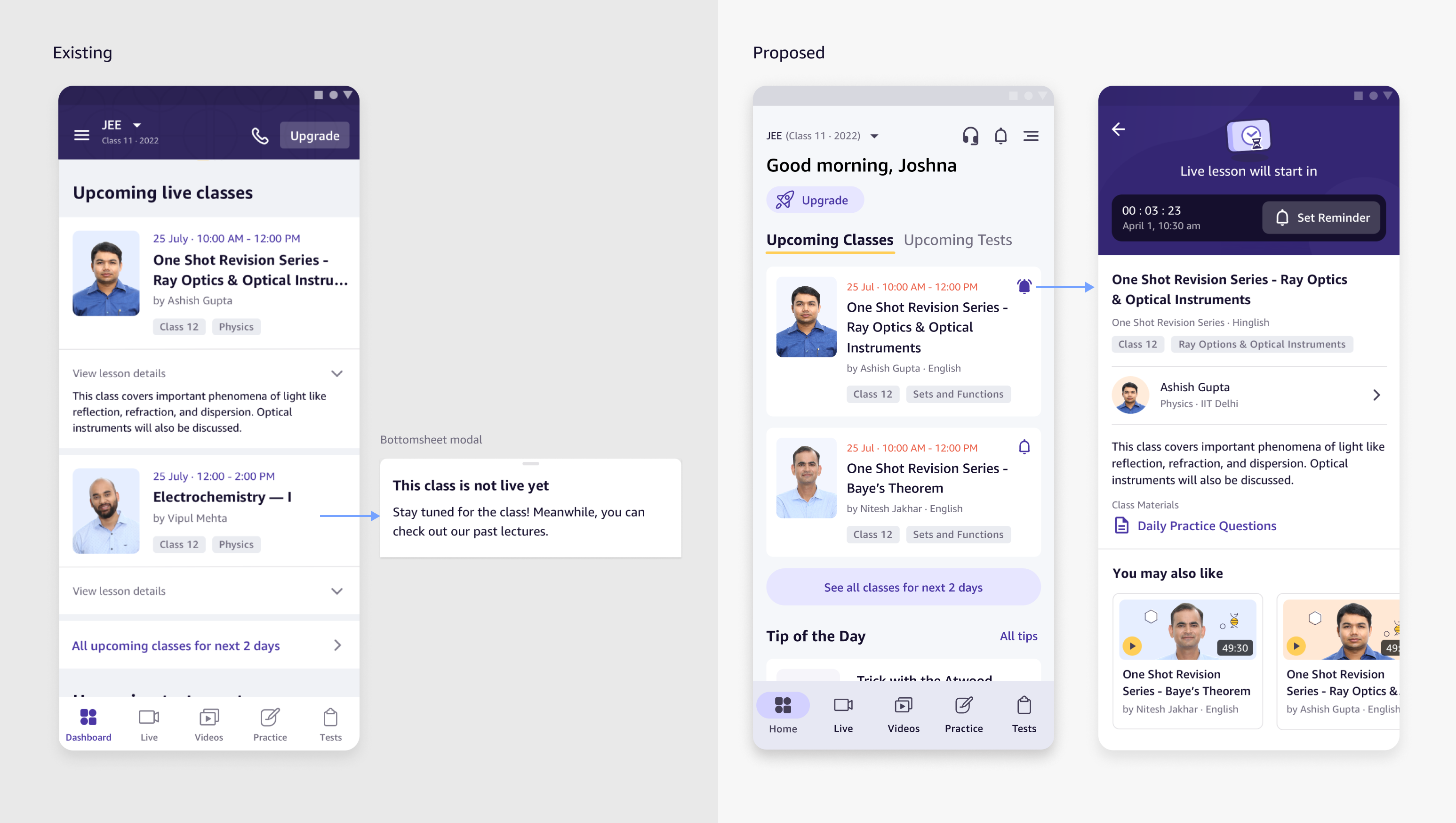
When classes are not live yet, it is easy to miss due to the lack of reminder capability. There is no meaningful follow-up action, as clicking on the card only shows a plain message. Adding a notification feature allows students to stay on top of the classes they are keen to join.

Apart from adding a notification, we can create a meaningful wait by re-directing students to related content, teacher’s profile, and class materials in advance too. An accessible place for teachers' credentials, like the profile page, would help to increase credibility which was important to students.

Validating with experiments
Impact of increased engagement in small-scale experiments
After discussing with the engineers and product manager, we decided to slice these ideas into short experiments to validate our design solution with quantitative data. Based on our discussions, I would simplify the scope and re-use what we have as much as possible - minimally to test the concept.

This helps us move fast towards an incremental progress (and reverse fast if need be).

1- Popular videos experiment

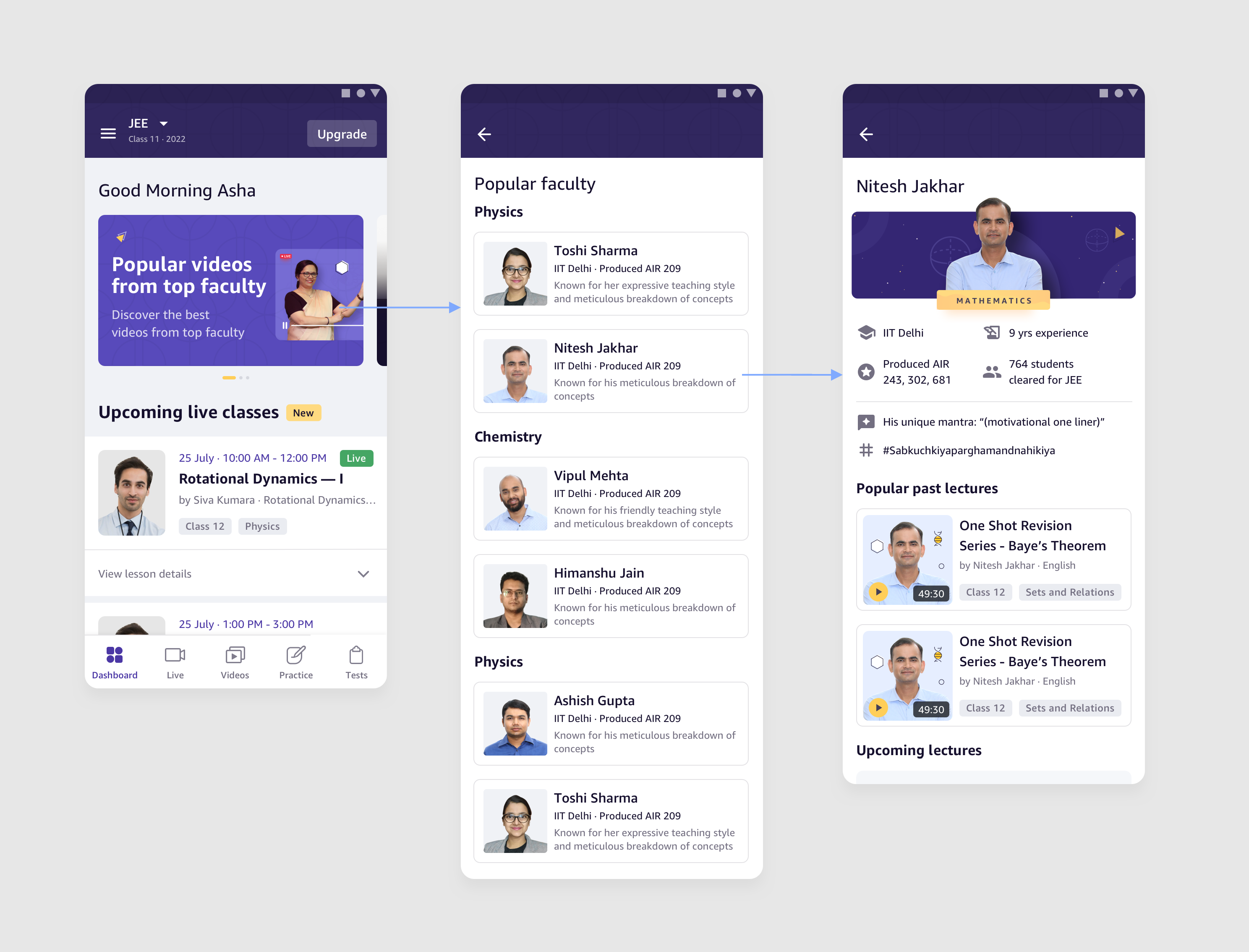
Instead of building a full carousel widget, we reused the simple hero banner card that opened up a listing page of top faculty videos, sorted by faculty. To solve the lack of credentials, teachers details have been listed in the faculty cards.

We received positive results from the experiment.

  • Avg. screen time increased by x3 for those who clicked in first 7 days versus those who did not
  • Average overall screen time of students who engaged with top faculty videos x2.5 higher than those who did not

2- Notifications for live lectures

We implemented an increment of the meaningful pre-live experience, starting with giving users to ability to set notifications for live lecture. Once again, we saw a significant uptake of the feature.

  • For 20 days since launch, total 3,911 notifications had been scheduled for 1,271 live lectures.
  • Out of 2,200+ users of this feature within first 20 days, 62% are new users on their first login day

The relevance of this feature to new users on their login day is highly important as our past insights show that keeping one engaged in the initial use gives us a higher chance of conversions.

What's Next and Reflections

Hitting new milestones as a designer, as a team

We were very encouraged by the positive metrics, we felt headed towards the right direction and stacked up these widgets as upcoming prioritisation –

  • Popular videos widget
  • Listing page content carousel widget
  • Dynamic Dashboard (FTUE use-case) as experiment

This was when we received the news that our product was going to wind down.

This was due to an worldwide organisational decision to focus on main businesses. It was hard news to hear, but understandable considering the state of the 2022 economy and struggle of the whole Ed-tech industry finding its relevancy in a post-pandemic world.

While we were unable to progress this project to the end, this has still been one of my most significant projects because it was pivotal to my personal growth as a designer. I had learnt to deliver solutions for ambiguous problems as a designer, firstly by aligning with partner teams to identify root cause of widespread problems through qualitative and quantitative data. It was also a new milestone of transitioning from a tactical designer, towards a strategic one.

Another key milestone was the baby steps towards setting up a data-informed design culture in my team. At the start as a new launch, we did not have sizeable metrics to draw reliable insights from, but now after 2 years we were empowered to do so, and I was definitely excited to see how data-informed decision making could bring our product culture to a new level.

Interested in other case studies?

Check out other projects related to the product
Payments
Delivering full payments experience
Amazon Academy overview
Redefining accessible education in India

Want to get in touch?

Drop me a line!

CONTACT ME