Aspire Design System

Redefining our design-development workflow
Project Overview
As our product scaled beyond a test feature, our team faced problems in our design-development workflow due to lack of reusable themes and components.

I took this opportunity to define a process where engineers and designers are working together, through a design system.
Year
2020
My Role
I led a team of 2 designers and 1 intern, collaborated with engineers to deliver the system and a refreshed product experience in 3 months. I based the UI of the new branding guidelines created in collaboration with a design agency.

Tasks: Design Systems, User Interface Design, Prototyping
The Team
4 designers, 1 product manager, 4 engineers, 1 researcher and design agency (for re-branding exercise)

Significantly reduced development time

With the design system, we achieved new heights with our designer-engineer partnership. The reusability of components made it easy to scale our designs across features –

  • Saving 19 weeks of development time to build a new feature, compared to the old framework
  • Increased trust between designers and engineers
How we got there
Uncovering compounding problems
During my time of entry, Amazon Academy was in its beta version known as JEEReady and only had a mobile test feature. My design challenge was to help scale Amazon Academy into a cross-platform test experience. In favour of speed to market, we decided to leverage on an established cross-platform library for development. We selected Material Design as a base, as it had high design and accessibility standards.

Hence, this led to having 2 separate libraries for mobile and desktop, with separate foundations of theming.

Upon the success of our beta mock test event, with an attendance of 20,000 students, we gained confidence to expand beyond a test feature and started to scale. However, as we scaled, we faced these key issues –

Unable to scale due to inconsistency in theming and components

Colour fragmentation and lack of reusability in components slowed down development time massively (we had 5 UI JIRA bugs per day!). Our one-off components prevented us from scaling fast. It also led to poor usability too as the experience is not visually coherent.

Lack of reusable components and colours, in a single page alone

No branding presence

When we conducted a focus group user research with 7 students - 1 student stated the app should be more colourful, another did not think Amazon was a natural fit for a test prep app. 

In another marketing research done with our JEEReady branding marketing collaterals, students said that while it looked professional, it was very “normal”.

(left) JEEReady branding for product beta (right) Marketing research conducted by our researcher
The Challenge
We needed a re-haul of our design framework, emphasising on reusability.
To launch well too, we need better brand presence.

Aligning teams to a common solve
Promoting advocacy of design system
The team was skeptical if a design system would be the right solve initially, considering the small size of our product and already strained timelines. Adding a new high effort project did not seem to get traction.

However, considering the scrappy approach leading to maintainability problems today, this would be a continuous downward slope – we would further compromise on setting the right foundations, resort to one-off solutions to save time. To add onto the problem, our design and engineering teams are spread across Singapore and India.

To my rescue, stakeholders and my product manager were already convinced that re-branding was an important exercise to do. Hence, I felt this was a prime opportunity to propose for a design system. As we re-brand, let us set foundations right.

I pulled together the evidences of our poor design-development workflow, talked to front-end engineers to gain their perspectives – in whom many were excited towards a more proper framework. This built a strong case and I was able to get the buy-in from my product manager, technical and business leadership. These were the main reasons I cited towards championing for a design system –

Development pain points listed by engineers
This built a strong case and I was able to get the buy-in from my product manager, technical and business leadership. These were the main reasons I cited towards championing for a design system –

  • Better collaboration between designers and developers
  • Improved customer experience and brand presence
  • Helps to scale fast for future features
Re-branding exercise with design agency
The re-branding exercise happening in parallel helped me build the case towards the design system. We collaborated with Moonraft, and informed the direction of our branding work through multiple branding researches conducted by our user researcher, Poorva Mankad.

Our final brand colours were purple, yellow and neutrals, to bring vibrancy and youthfulness to our brand.
Design Principles
To align the team to the same vision and framework for decision-making, I set core design principles for our design system

Easy

Our experiences aim to require little effort, deciphering, or learning to use from the user. This includes employing clear language, familiar controls and distinct hierarchy to guide customers to predictable outcomes.

Dynamic

Vivid yet natural forms to soften pixeled displays and appeal to the youthful target audience. Employ qualities such as balance, shape, colour, hierarchy, repetition, space, emphasis, and harmony.

Intentional

Users should always be empowered to know exactly what they should be doing and why. This includes decreasing visual noise, amplifying primary actions, providing relevant context to users.

Design Process
Explorations, mass production, implementation
To create our first design system, I employed processes to ensure we meet the bar of best practices. I informed my design decisions by synthesising learnings from mature design systems, as well as our new brand guidelines.

I guided a team of 2 designers (Lily Soh, Poorva Mankad) and 1 intern (Karthik Arvind) to experiment with layouts, type scale and colour mapping. Basing off mock references from Moonraft's re-branding exercise, we would further explore upon them to ensure that the components on the designs are not just systematic and reusable, but hits the bar for accessibility and usability as well.

I would collate all the explorations, synthesise usability and accessibility learnings from best practices, and produce the final direction for the design.
Designs in collaboration with Moonraft
Designs in collaboration with Poorva and Karthik

Mass implementation of redesign throughout product

With the final direction of designs set, I would guide the team to define components in the design system and assemble the new components throughout the existing product features – both desktop and mobile, across use-cases and edge-cases.

Throughout this process, I was closely collaborating with the engineering team to firstly ensure that our properties and themes would be mapped functionally in the design system, and our designs were feasible to implement.

Our product-wide redesign implementation plan
Design Release 🎉
Hand-off and documentation
Our first cut of designs were done and it was time to hand-off! But our involvement does not end here. We were closely involved in the implementation process. We were using Invision at that time to upload our design system, and I would document the releases.

Based on feedback from technical team to simplify where necessary or to account for missing states, we would iterate on the components and update the documentation.

Before and after of our design library
Our new design system
Introducing Amazon Academy
Putting it together
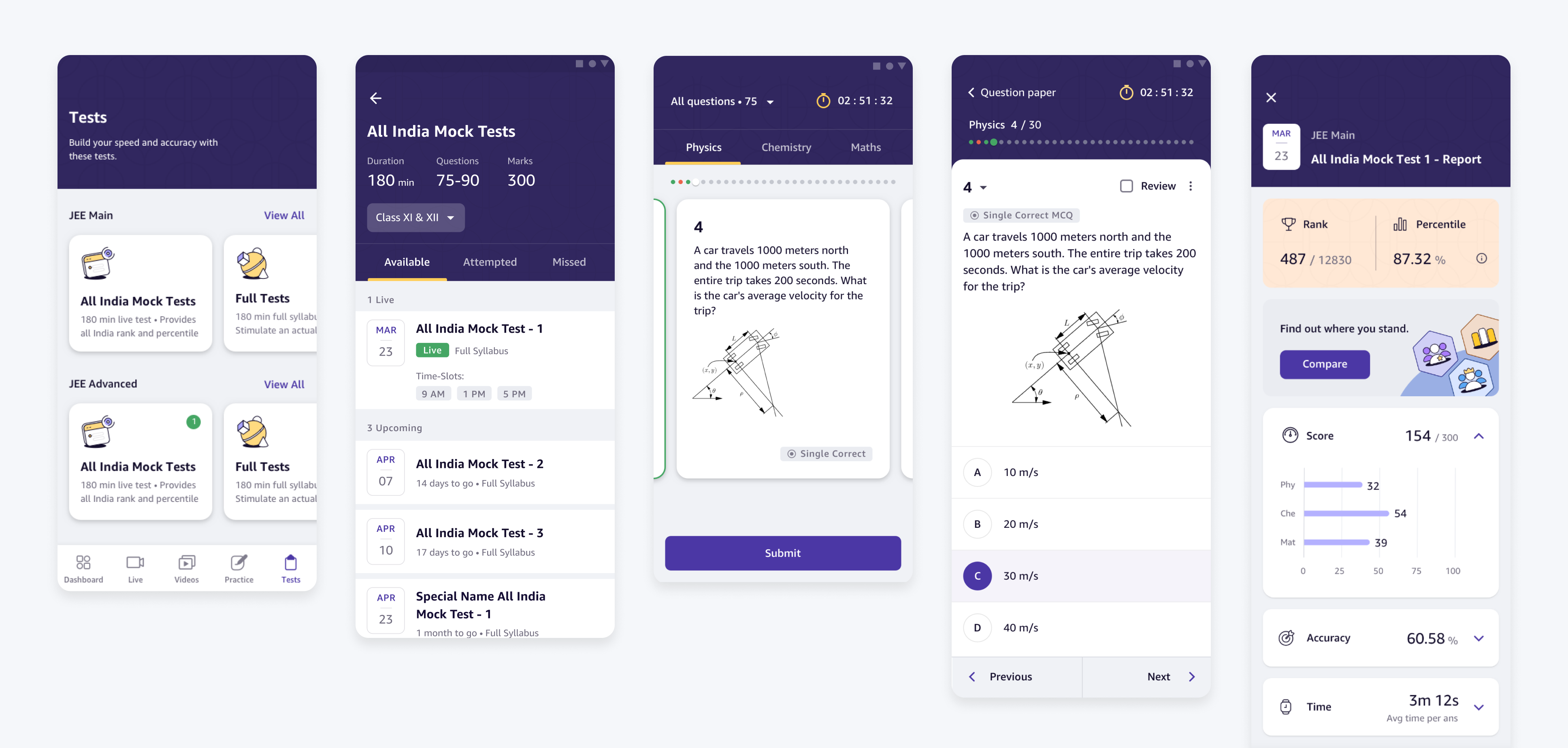
Sample of product's application of the new design system components
Uplifted test experience
Before and after of report
Before and after of dashboard
Impact and reflection

Defining the new standard for Amazon Academy

Once again, the biggest achievement through this process was the new levels of collaboration with designers and engineers –

  • Saveing 19 weeks of development time compared to the old framework to build new feature
  • Increased trust between designers and engineers, as engineers feel included in our process
  • Replicating test experience for Africa market in 1 month
  • Happy customers regarding our UI
“the UI, resources, the teachers are VERY good”

Student, NPS survey

“The teachers are excellent, doubts solved instantly. The UI too is good and user friendly.”

Student, NPS survey

This was the first time I was working with design systems. While initially daunting, I learnt a lot about defining design patterns and processes; and more importantly to help drive adoption of these across teams, setting the new standard for Amazon Academy. Through this process, I learnt to be a better partner with engineers as well, empathising and designing in a way that is effective for them.

Our work in design system is never finished. We continue to iterate based on improvements to usability, accessibility and most importantly to meet feature gaps.

One of the big projects on iterating on our design standards, was related to improving our content discovery –

Improving Product Discovery
Recapturing the simplicity of learning

Interested in other case studies?

Check out other projects related to the product
Payments
Delivering full payments experience
Amazon Academy overview
Redefining accessible education in India

Want to get in touch?

Drop me a line!

CONTACT ME